Happy Friday, Friends. Or happy whatever day it is when you’re listening.
If you’re new or you’ve been listening for a while – nice to meet you and I’m grateful that you listen and share! It’s been a minute since I formally introduced myself on the podcast, so I thought I’d take a minute to do that before we get to today’s topic.
My company, Melissa Burkheimer Studios, is here to design iconic sales pages that convert, and show expert entrepreneurs how to launch their offers online and get results.
I love what I do, and I’m driven by a really strong mission to give conversion design a bigger voice in the online business space & love building a business that gives me the freedom to sleep in, earn as much as I want to, and help my clients get blockbuster results.
I work with clients inside my digital courses in programs, VIP Days, and 1:1 when we design sales pages. Swipe to see some samples of my work & check out melissaburkheimer.com for more information – and send me an email at design@melissaburkheimer.com if you’re interested in working together.
One really quick thing – I’m working on something fun to celebrate the 2-year anniversary of the podcast and here’s what I want to know.
What’s one action you’ve taken as a result of listening to this podcast?
Maybe you started or grew your freelance business, or started designing sales pages.
Or maybe you got motivated to apply for your dream job, or just know that you’re not alone in your design world.
Have you bought someone’s course as a result of listening? Or signed up for their email list? I want to know all of those things so I can celebrate you.
Please send me an email with deets at design@Melissaburkheimer.com or a DM on Instagram. If you send it to me by October 15, you’ll get free access to a brand new advanced sales page design training I’m hosting live (only once!).
Okay – now today, I want to talk to you about 3 design elements you can add to your sales page to help increase conversions.
When people ask me what a sales page is, I like to compare it to an infomercial. Instead of it being a long broadcast on TV, it’s a web page containing conversion copy, messaging, design, photography and a user experience with one goal in mind: make the sale.
There’s a lot of information out there about writing + designing sales pages.
What works and doesn’t work depends on a lot of things. Your offer, your copy, your UX, the mobile design, the audience, the marketing strategy and more.
When we design our sales page with the conversion goal in mind, it’s like making sure that if you go to Starbucks, someone is taking orders and collecting payment at the cash register.
If no one is there to take your money – and there’s no menu to order from, you’re missing a huge step in the buyer’s journey.
In the online buyer’s journey – the sales page is an important step in the digital sales process.
The first part of your sales page is called the “hero section” – and it’s the first part of your sales page design. You have about 8 seconds to get people’s attention, so the hero section has wow them. This is a part of my Design Your Sales Page pillar of the Launch Design That Converts method I teach my students inside Conversion Design School™. Most people skip this step, and when they do that they create a sales page that doesn’t get them the results you want, and that may be exactly what you’re doing right now.
When you carefully map out your sales page design, you simply need to write down all highlight the benefits that your clients experience, a results-focused headline, and some type of brand identity.
Here are 3 design elements that you should use on all of your sales pages, especially in the hero section.
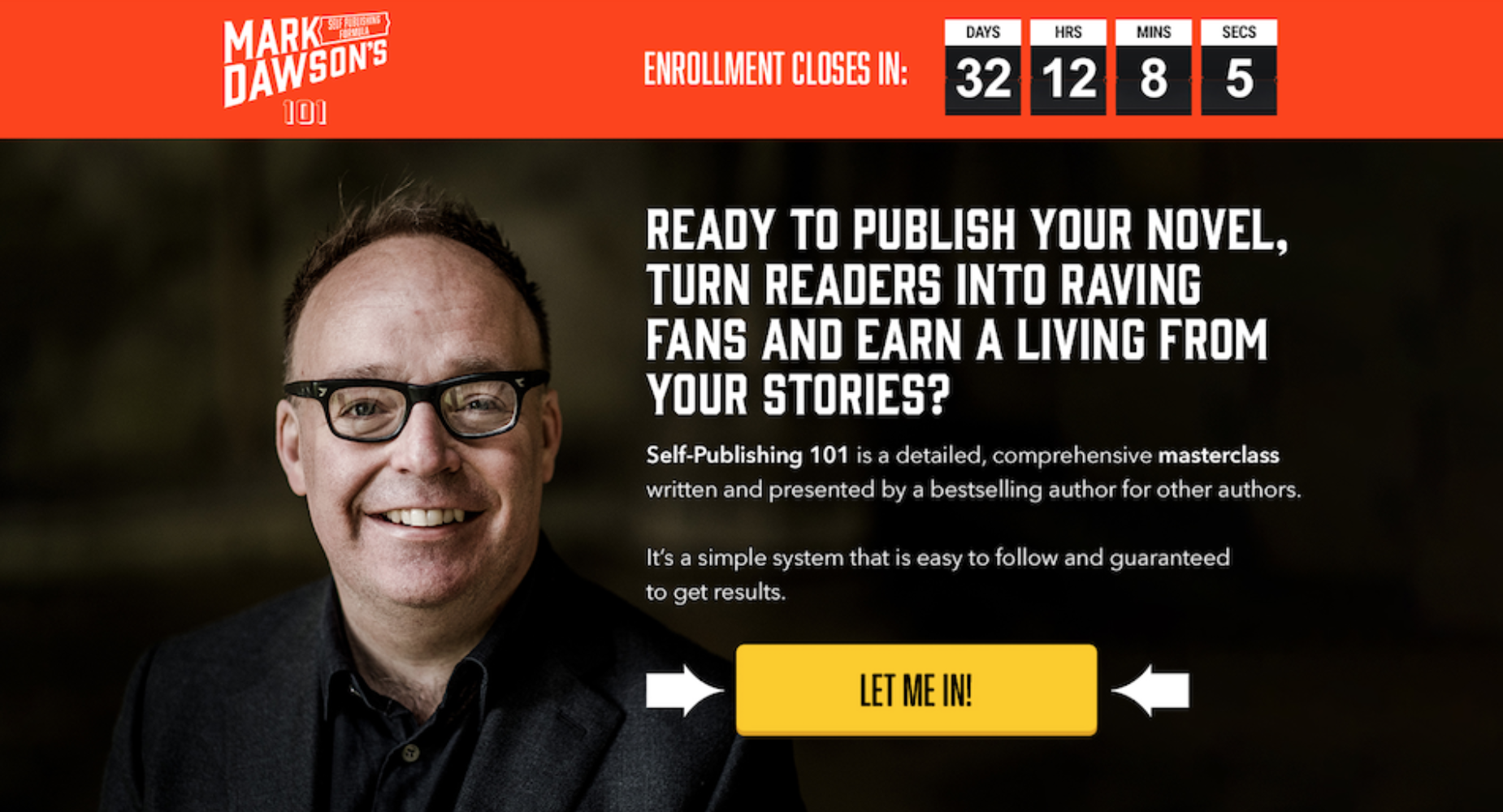
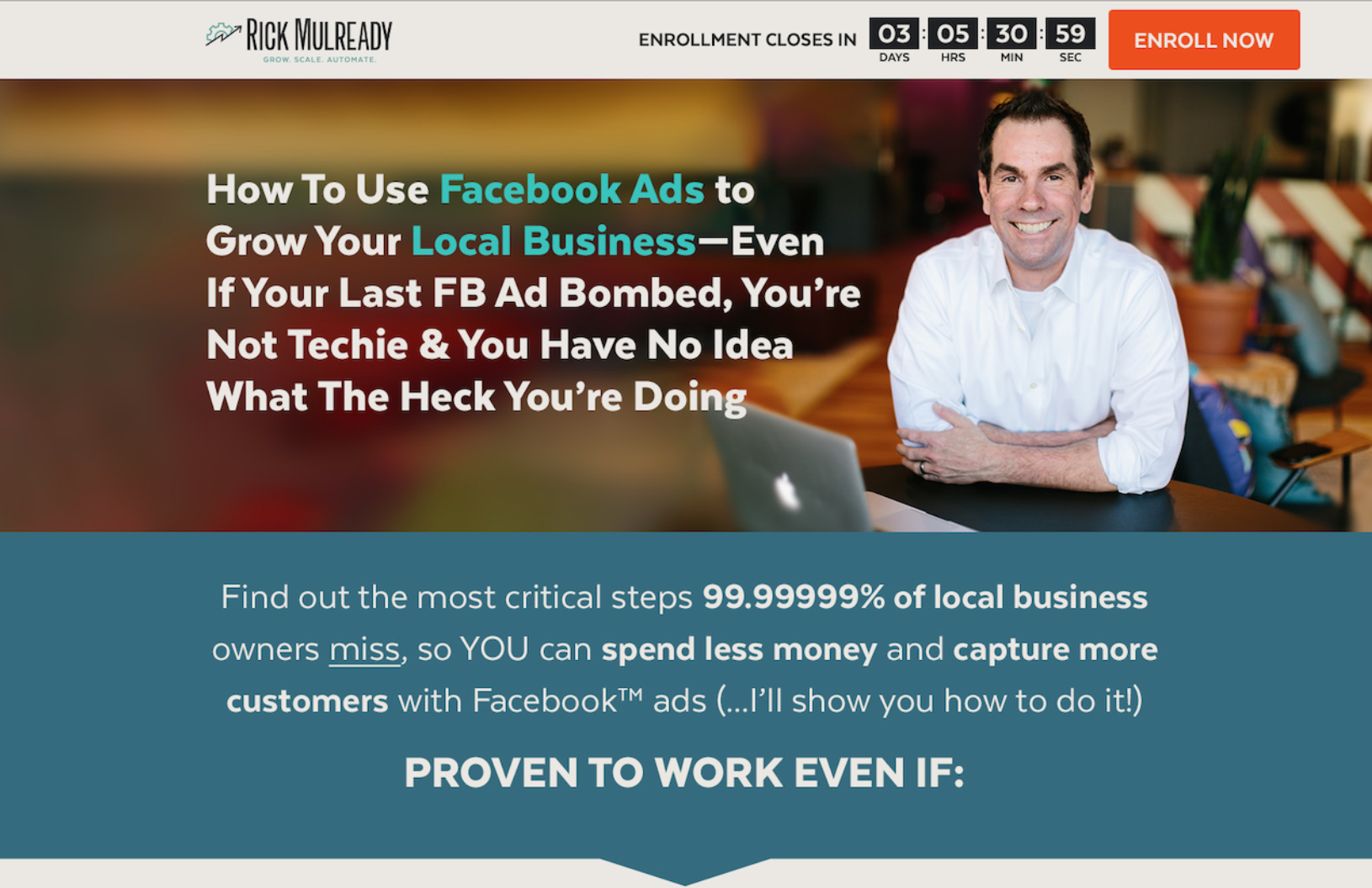
1. Directional cues. so we know what action to take next. These can be added as arrows instead of bullet points, arrows guiding you from one section to the next, or even arrows pointing to the call-to-action.
2. A countdown timer in a sticky menu (the menu stays in your browser as you scroll).
3. A brightly colored button (call-to-action) that takes the user on the buyer’s journey.
Sample #1: In this sales page example, we have directional cues pointing to the brightly colored button and a countdown timer in the header menu.
Sample #2: The directional cue is placed below the second section, indicating you should scroll. The countdown timer is in the sticky menu next to the brightly colored button.
You can create the best product in the world – but if the hero section doesn’t connect with your visitors, no one will scroll, so we want to make it easy for them to buy from you! MMkay?
You can use these simple design elements all throughout your sales page.
You can create the best product in the world – but if the hero section doesn’t connect with your visitors, no one will scroll, so we want to make it easy for them to buy from you!
A sales page alone does not guarantee sales, but when used as a part of your sales system, it can do the selling for you, making it a magical asset in your business that can help do the thing all businesses need to survive: MAKE SALES!
If you want even more tips to help you get better results from your sales page designs, sign up for my Sales Page Trello Board and get a copy outline, offer checklist, design samples, a process map to help you sellout your next launch with a Sales Page Hero Section that Connects + Converts. You can get immediate access when you sign up at http://melissaburkheimer.com/salespagetoolkit
Like what you heard?
