Hey friends! Melissa here. If you’re new or if you’ve been engaging with the podcast for
It’s the first week of May 2022, also my birthday week, and if you’re like me, you’re looking to produce some game-changing results in your business or professional career.
For me, this means bringing new offers, a brand refresh and strategic visibility to life. And to stop dragging my feet. How’s that for real life accountability? (That’s me making fun of myself!)
While I’m not designing sales pages anymore, I still sell my $37 course, Sales Page Superstar and will continue to use the principles + strategies I teach inside the course as I build my new brand.
Last week I sent an email to my list with the subject line: “3 design elements to add to your sales page hero section for higher conversions (samples inside)” and it got a 42.4% open rate, which I thought was pretty impressive. 🙂
So, I thought I’d repurpose that content here for a short, fun episode this week.
When I was designing sales pages, I spent the MOST time designing the hero section of my clients’ sales page.
The “hero section” is the part of your sales page on a desktop you see before you scroll down.
You have about 8 seconds to get people’s attention, so the hero section has to wow them. When you map out your sales page hero section, there are 3 must-have elements for you to include:
- A headline that highlights your offer promise.
- A branded identity like a photo, logo or sales video so people know who they’re buying from.
- A distinctly-designed button, so the user knows what the call-to-action is.
Do NOT include:
A photo of you and your Lambo.
A link to your YouTube channel.
Any language or messaging that tells the user they will fail unless they buy from you. This is a big no-no.
We don’t want to confuse or mislead anyone. We want them to be excited about what you have to offer.
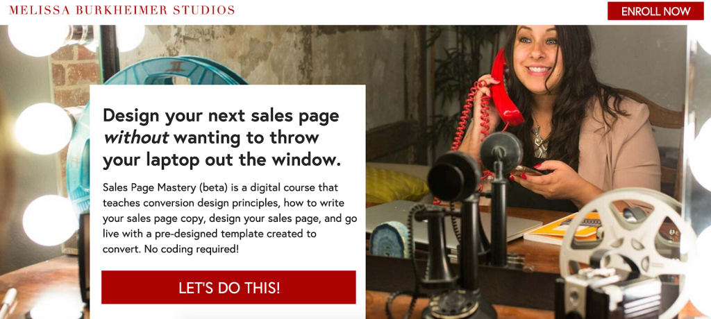
Sample #1: The sales page hero section for my mini sales page course, Sales Page Superstar. You see my photo, my logo, and my brand colors, with a distinct headline and subhead that describes my course, and two buttons.
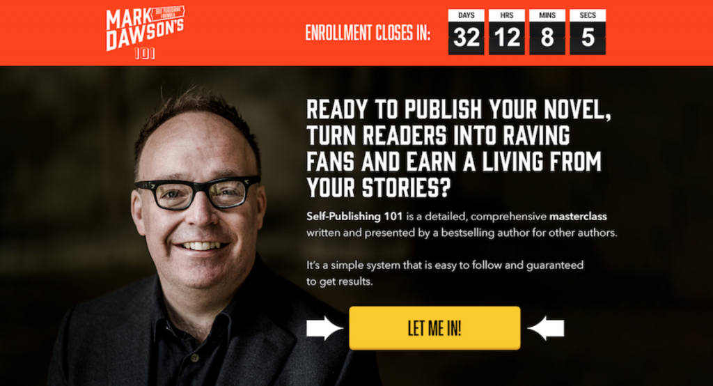
Sample #2: In this sales page example we have a strong headline, brightly colored button, a logo, the brand photo, and directional cues pointing towards the call-to-action.
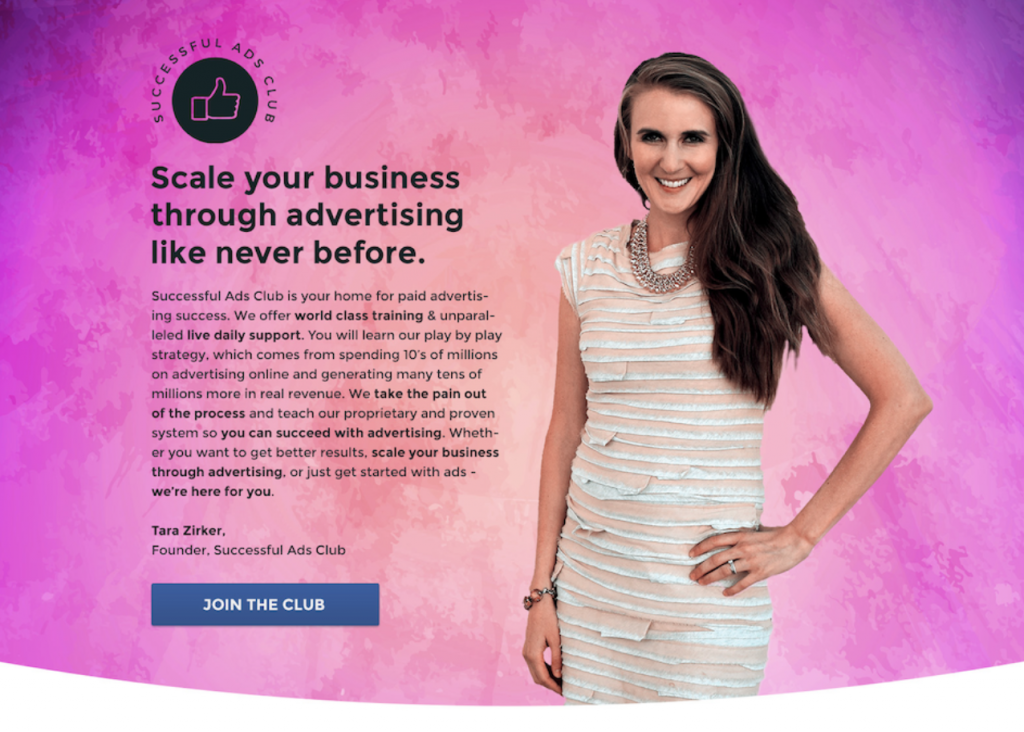
Sample #3: In this example, we have a sales page hero section I designed for Successful Ads Club that includes the program logo, a photo of the founder, a simple headline, a supporting paragraph about the program, and a button that says “Join the Club.”
A sophisticated sales page design is a great way to position yourself as an authority in your industry. You can create the best product or service in the world – but if the hero section doesn’t connect with your visitors, no one will scroll, so let’s make it easy for them to buy from you! MMkay?
If you like this episode, you can find more strategic tips + more inside my $37 sales page course, Sales Page Superstar. Visit https://salespagesuperstar.com to see if it’s right for you.
Thanks for reading / listening. I hope all your dreams come true.
Links mentioned:
Episode 169 of The Design Business Show
Like what you heard?
Click here to subscribe + leave a review on iTunes.
